
FREE
Loading…
OpenAI's newest image model, running here in full as gpt-image-2.5-flare. Attach a photo and one instruction changes the part you named while the camera angle, the light and the shadows stay exactly where they were — or leave the photo out and the same box generates from scratch, with real transparent PNG when you ask for it.
Every image below was generated on gpt-image-2.5-flare on 10 September 2026. The eight edit cases show our own before and our own after — the same file, fed back with the instruction printed beside it. Copy any prompt into the box above.
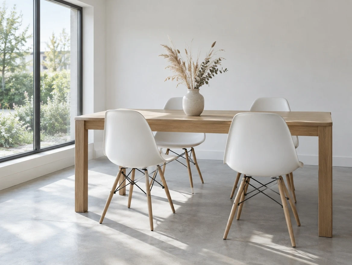
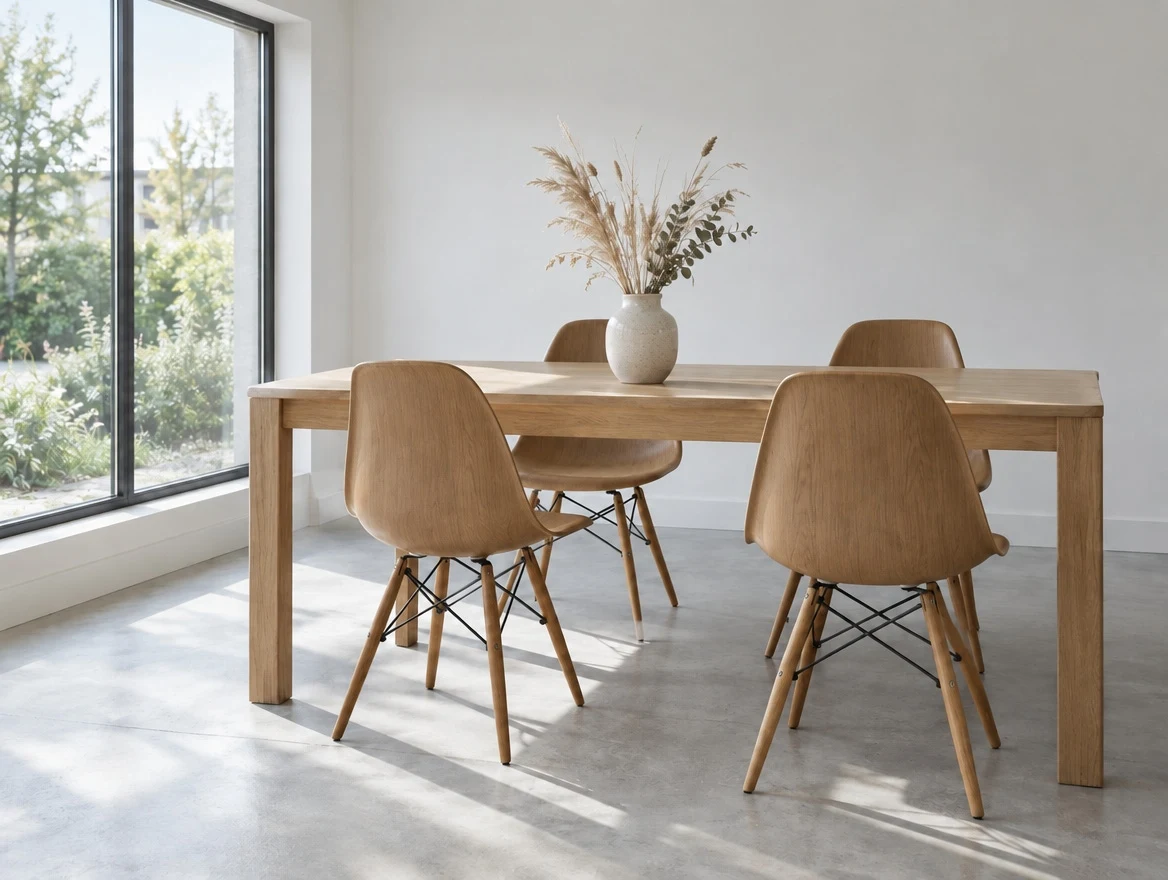
The behaviour 2.5 is built around. The chairs became solid oak; the camera angle, the daylight from the left, every floor shadow, the table and the vase are untouched. Ask an older model for the same edit and it re-renders the room.
“In this room photo, replace ONLY the white chairs with chairs made of warm mid-brown solid oak, same silhouette and same positions. Preserve the camera angle, the room lighting, the direction and softness of every floor shadow, the table, the vase and every surrounding object exactly as they are.”
 Before
 AI Result
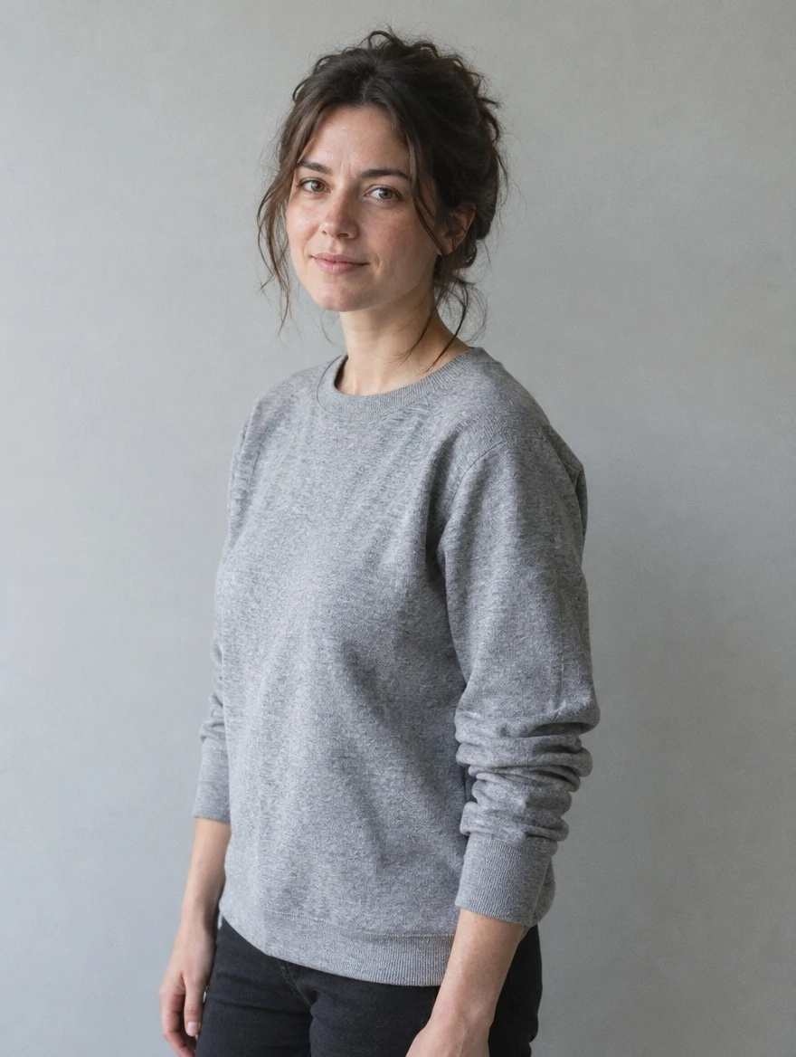
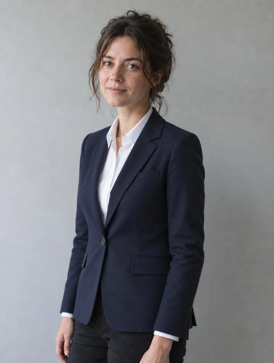
A garment change with the identity locked: same face, same hairstyle, same expression, same posture, same studio wall and the same soft light from camera left. This is the edit that fails most obviously on other models, because a slightly different face is instantly recognisable as a different person.
“Replace only her clothing with a tailored navy single-breasted blazer over a white shirt. Do not change her face, facial features, skin tone, hairstyle, expression, body shape, pose or proportions in any way. Preserve her exact likeness. Change nothing except the garment.”
 Before
 AI Result
Eleven words, and the peonies are gone. The hand keeps its position and its fingers, the denim jacket keeps its folds, and the blurred shopfront behind him is the same blurred shopfront — no smeared patch where the flowers used to be.
“Remove the flowers from the man's hand. Do not change anything else.”
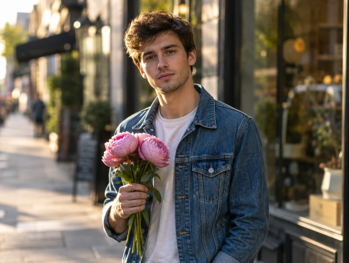 Before
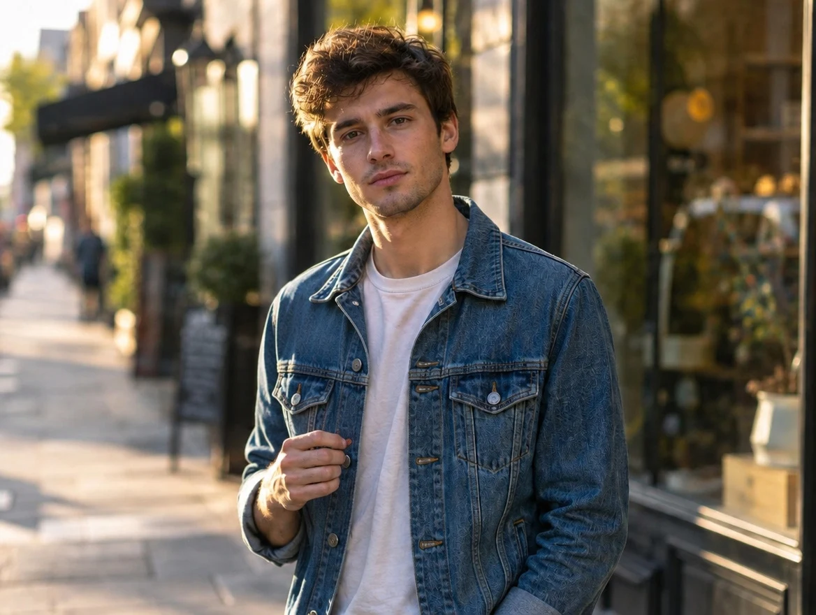 AI Result
The clearest test of whether a model understands a scene or is only rearranging pixels. The lamp moved to the right side of the desk, so the warm pool of light and the glow on the wall followed it, and the shadow of the books flipped from the right of the stack to the left. Nothing asked for the shadow specifically.
“Move the lamp to the right side of the desk. Recompute the lighting correctly for its new position: the pool of warm light and the wall glow must follow the lamp, and the shadow of the books must now fall to the left instead of the right. Keep the desk, the books, the room, the camera angle and the exposure exactly as they are.”
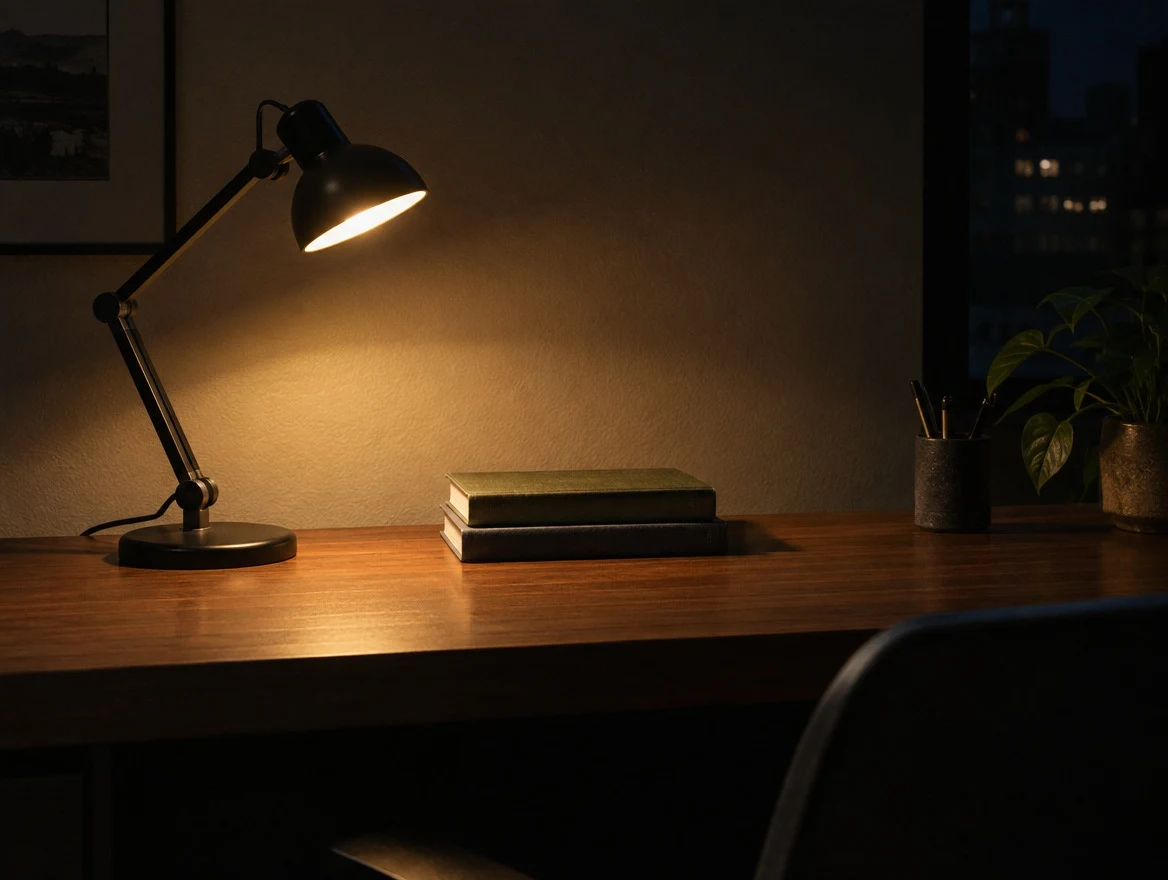 Before
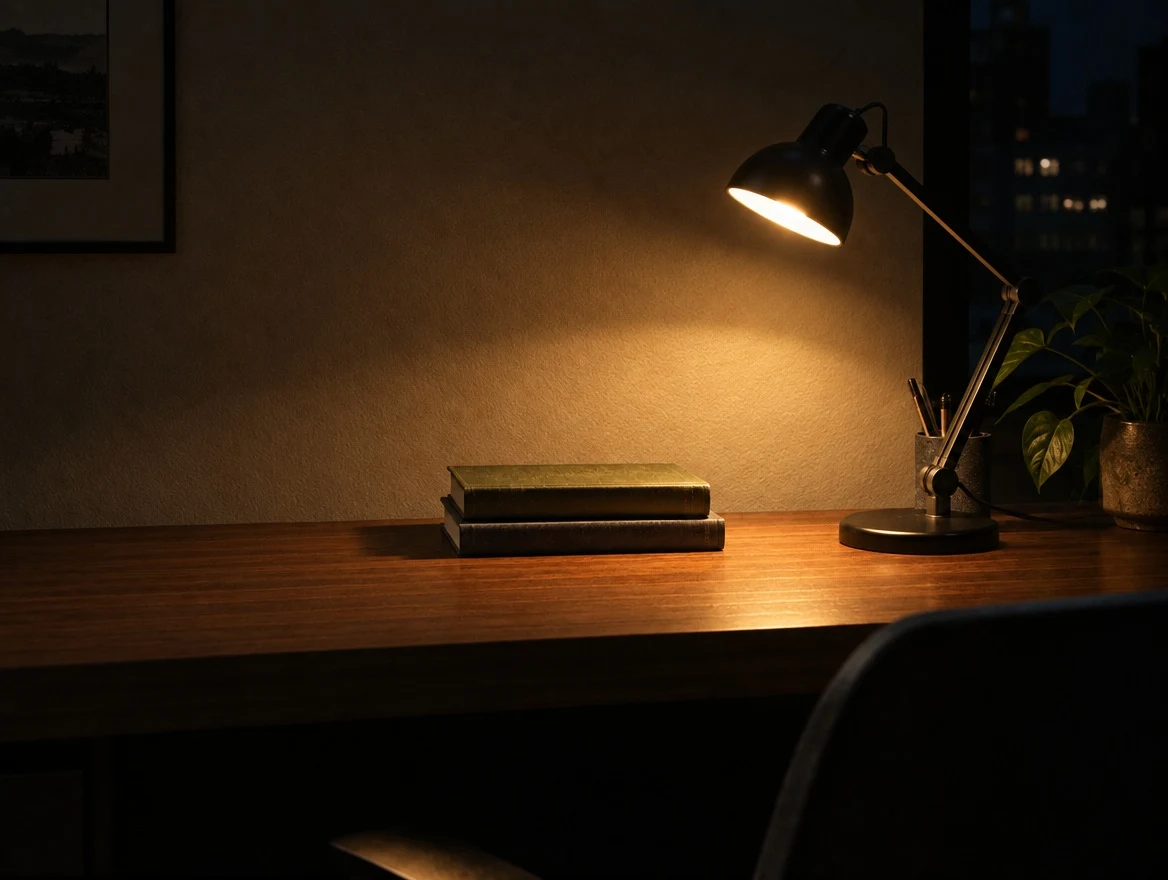 AI Result
Every word became Spanish and nothing else moved. Same four icons, same numbered circles in the same positions, same rule under the title, same two-line headings and three-line captions, same margins. Very few image models can rewrite type inside a finished layout without rebuilding the layout — this is the case to reach for when a design has to ship in several languages.
“Translate every piece of text in this infographic into natural, idiomatic Spanish. Do not change any other aspect of the image — keep the identical layout, grid, margins, icons, colours, type sizes, weights and alignment. Only the words change.”
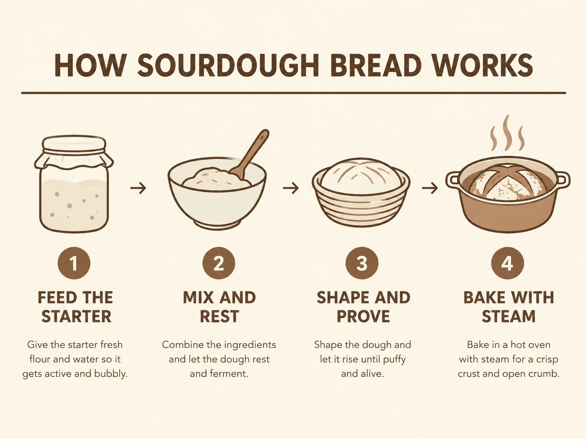 Before
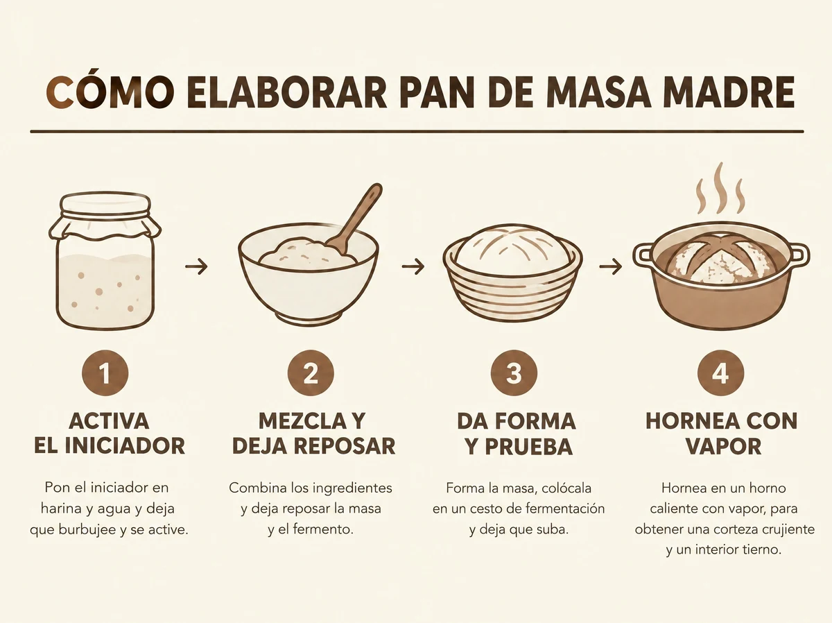 AI Result
Waxy pore-less skin, an orange cast, blown highlights and a mushy background go in; real skin texture, neutral white balance, recovered highlights, hair that separates from the background and genuine optical depth of field come out. Same person, same expression, same framing — the giveaways are what changed.
“Make this look like a real photograph taken on a full-frame camera. Restore natural skin texture with visible pores and fine lines, remove the plastic airbrushed smoothing, neutralise the orange colour cast to accurate white balance, recover detail in the blown highlights, give the hair real strand separation, and replace the mushy bokeh with realistic optical depth of field and fine grain.”
 Before
 AI Result
Ask for a transparent background and 2.5 returns actual alpha — shown here on a checkerboard, the way every image editor displays transparency. Note the glass: the checker pattern reads through the bottle body because the alpha is partial there, not simply on or off. GPT Image 2 could not do this at all, which makes a cutout the fastest way to tell the two models apart.
“Extract the product from this image and isolate it on a fully transparent background. Centred product, crisp silhouette, no halos or fringing, no drop shadow. Preserve the product geometry, colour and label legibility exactly.”
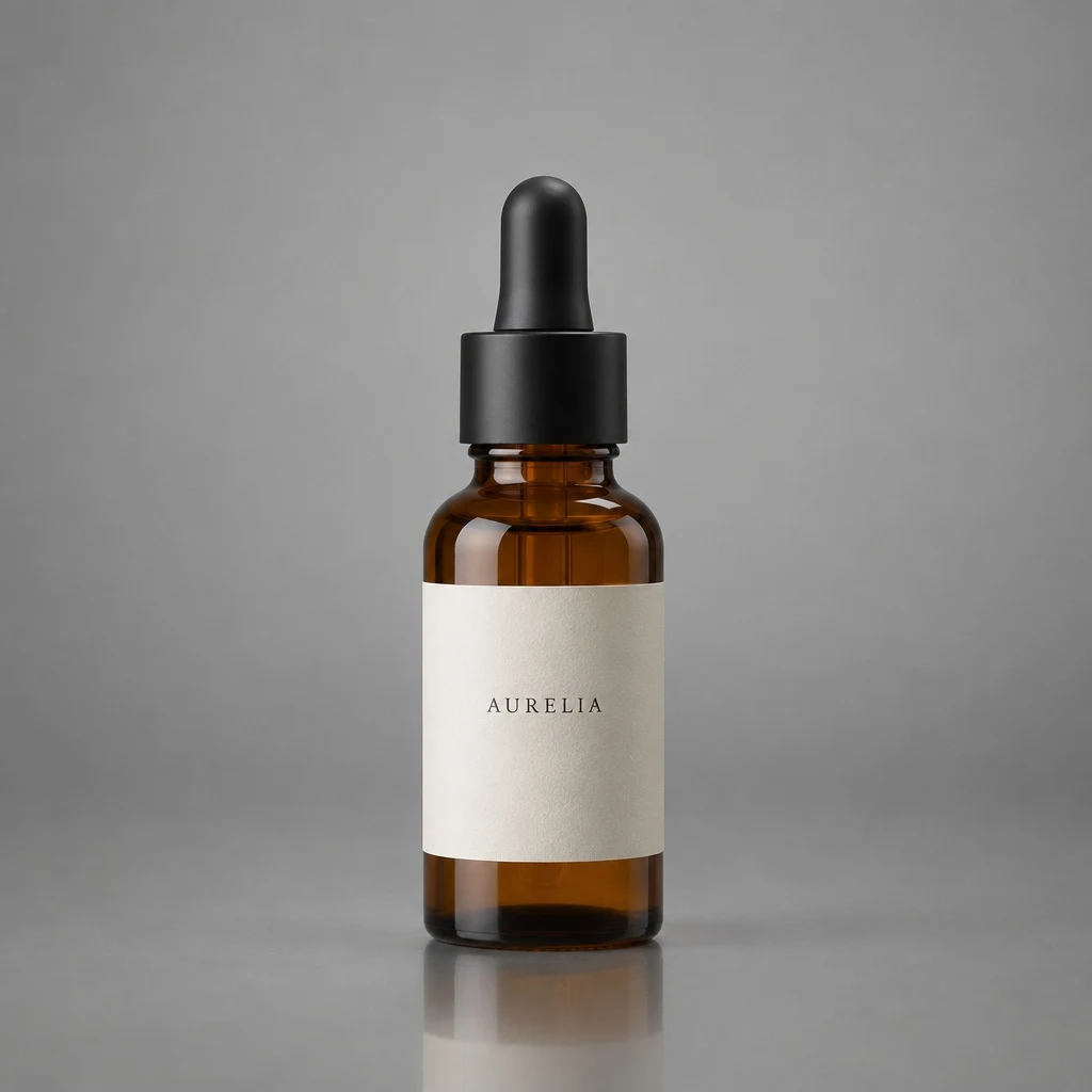 Before
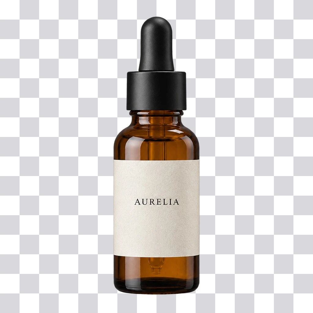 AI Result
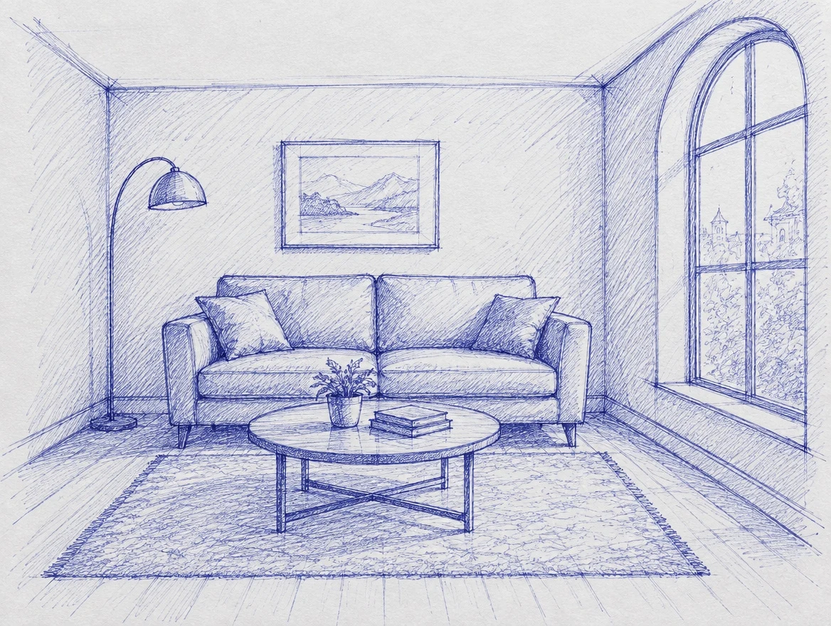
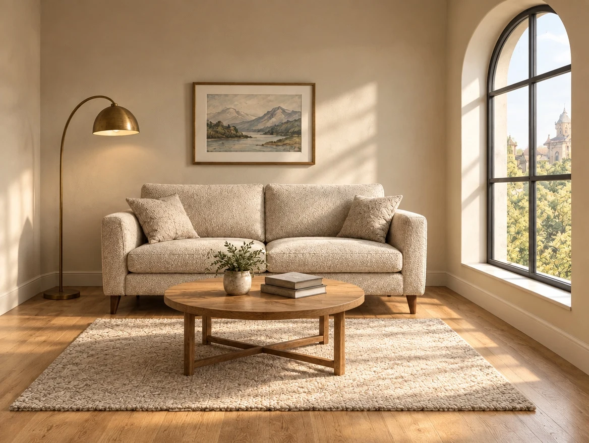
A ballpoint scribble in, a photograph out, with the layout intact: the sofa is still against the back wall, the round table still in front of it, the arched window still on the right, the lamp still in the left corner. The model chose the materials — boucle, oak, wool — and kept the perspective it was handed.
“Turn this drawing into a photorealistic photograph. Preserve the exact layout, proportions and perspective of the sketch. Choose realistic materials and lighting consistent with the sketch intent. Do not add new elements or any text.”
 Before
 AI Result
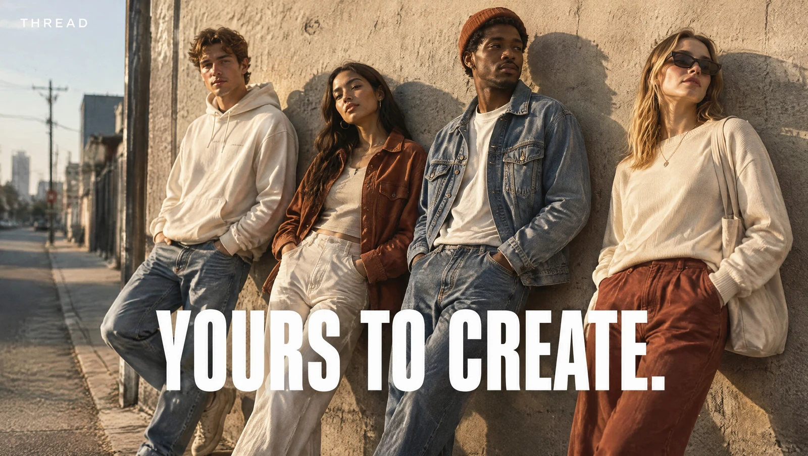
No reference image — this is the model drawing a finished campaign. Both pieces of copy are set cleanly into the photograph rather than pasted over it: the tagline sits on the wall behind the group in the same light, and the wordmark holds the top-left corner. Correct spelling in an image is still where most generators fall over.
“A polished streetwear campaign photograph for an invented brand called Thread. Four friends in their twenties leaning against a sun-warmed concrete wall in a city side street, golden-hour side light, shot on a 35mm lens with fine grain. Across the lower third, the tagline "YOURS TO CREATE." set in a bold condensed sans-serif in white, and the wordmark "THREAD" small in the top left corner. The text must be crisp, correctly spelled and integrated into the photograph like a real printed campaign.”
 Generated
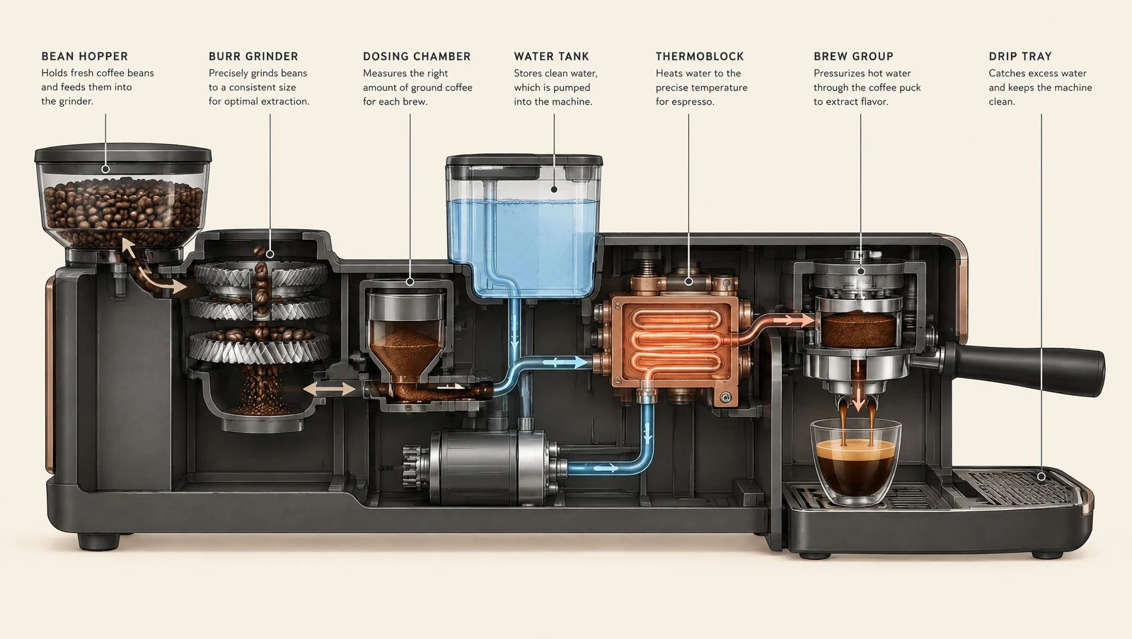
Seven components, seven correct labels, seven captions that describe the right part, and leader lines that land on the thing they name. The flow is colour-coded the way an editorial illustrator would do it — beans in beige, cold water in blue, pressurised hot water in copper. Written prompts get this far because the model reasons about the subject before it draws.
“A detailed technical infographic explaining how an automatic bean-to-cup espresso machine works, drawn as a clean cutaway diagram on a warm off-white background. Label each stage left to right with a thin leader line and small crisp sans-serif type: BEAN HOPPER, BURR GRINDER, DOSING CHAMBER, WATER TANK, THERMOBLOCK, BREW GROUP, DRIP TRAY. A thin arrow follows the path of the beans and then the water through the machine. Muted charcoal and copper palette, generous margins, every word legible.”
 Generated
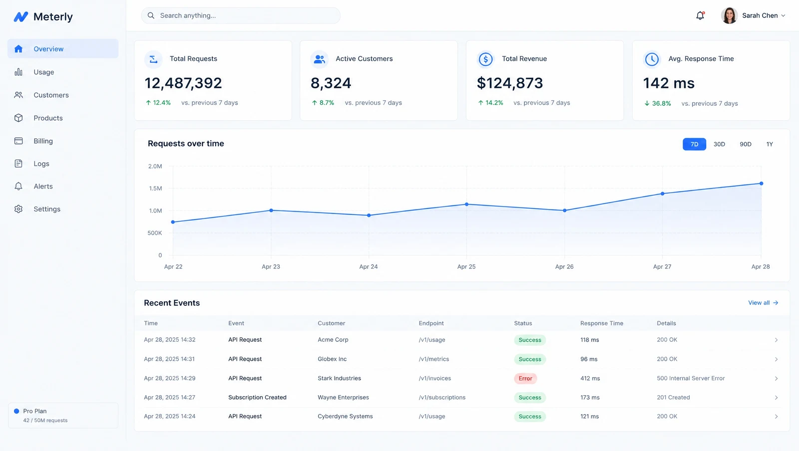
A whole product screen from a description: fixed sidebar, KPI row, chart with real axis labels, and a data table whose status pills, endpoints and response times are internally consistent. Useful when you need a convincing screen for a deck or a marketing page before the thing exists.
“A highly realistic desktop screenshot of a light-mode SaaS analytics web app called Meterly. Fixed 240px left sidebar with a small logo and eight navigation items, a top bar with search and an avatar, then a main area with four KPI cards in a row, a large line chart below them titled "Requests over time", and a data table of recent events at the bottom with column headers and status pills. Cobalt blue accent on a white and light-grey surface, 8px grid, consistent spacing, realistic typographic hierarchy, crisp legible interface text throughout. No browser chrome.”
 Generated
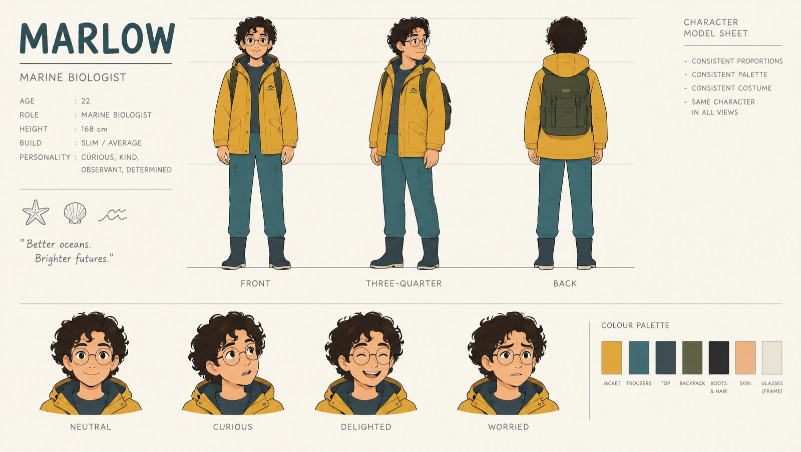
An animation model sheet where the front, three-quarter and back turnaround are unmistakably the same person, with the same proportions, the same mustard jacket and the same round glasses — plus four labelled expressions and a colour-swatch strip. Character consistency inside a single frame is the prerequisite for consistency across a series.
“A character-design reference sheet on a clean light cream background, laid out like an official animation model sheet, every view showing the SAME character with fully consistent proportions, palette and costume: a young marine biologist in a mustard rain jacket, teal trousers and round glasses. Top-left a title block reading "MARLOW". Centre row: FRONT, THREE-QUARTER and BACK full-body turnaround on a shared guide line. Bottom row: four head expressions labelled NEUTRAL, CURIOUS, DELIGHTED, WORRIED, plus a small colour-swatch strip.”
 Generated
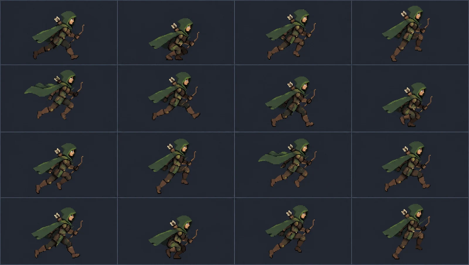
A 4x4 sprite grid where the ranger keeps identical proportions, palette, hood and cape across all sixteen cells while the pose walks through a run cycle. The lesson is in the prompt: naming the pose of each frame is what produces motion. Ask for "a 16-frame run cycle" and you get sixteen near-identical drawings.
“A pixel-art sprite sheet on a flat dark slate background, a strict 4 by 4 grid of 16 frames, showing one full run cycle of the SAME hooded ranger, side view facing right. Identical proportions, palette, hood, cape and silhouette in every frame — only the pose advances. Frame by frame: 1 contact, right leg forward and straight; 2 body lowest, both knees deeply bent; 3 push off, right leg extended behind; 4 passing pose, left knee lifted high; 5 airborne, both feet off the ground, cape streaming; … 16 passing pose closing back into frame 1. Arms swing in opposition to the legs. Limited 16-colour palette, crisp hard pixel edges, no anti-aliasing.”
 Generated
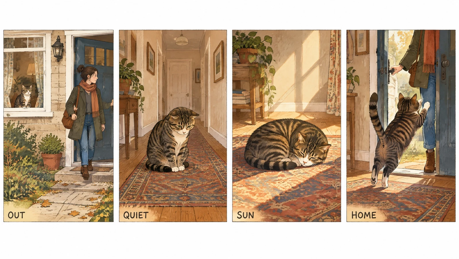
The same tabby, with the same markings, in four panels that read as one afternoon — and hand-lettered captions that say what they were told to say. Sequential art is a consistency problem disguised as a drawing problem, which is why it belongs on this page rather than a gallery.
“A four-panel comic strip in a single horizontal row with even white gutters, in a warm hand-inked storybook style with flat gouache colour. The SAME tabby cat appears in all four panels with consistent markings. Panel 1: the owner steps out of the front door, the cat watching from the window. Panel 2: the cat alone in the quiet hallway, ears low. Panel 3: the cat curled asleep in a sunbeam on the rug. Panel 4: the door opens and the cat leaps up, tail high. Small hand-lettered caption bottom-left of each panel reading, in order, "OUT", "QUIET", "SUN", "HOME".”
 Generated
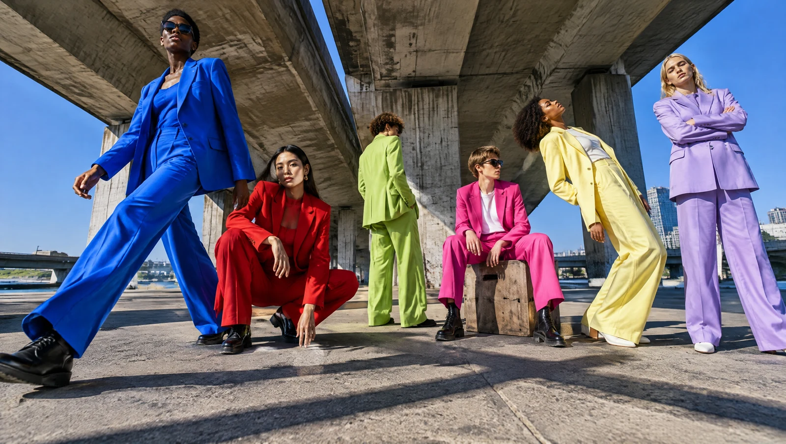
Six people, six named colours, six different poses, one 24mm camera on the ground tilted upward, hard midday sun with long crossing shadows — and all of it resolved rather than averaged into a blur. Prompts that pile on constraints are where instruction-following stops being a benchmark number and starts being visible.
“A fashion campaign photograph for an invented label, shot from a camera placed on the ground with a 24mm lens tilted fifteen degrees upward. Six people posed completely differently — one mid-stride, one crouched, one turning away, one seated on a crate, one leaning back, one arms crossed — wearing electric blue, tomato red, lime green, hot pink, butter yellow and lilac tailoring against a raw concrete underpass. Hard midday sun with long crossing shadows, deep saturated colour, everything sharp from front to back.”
 Generated
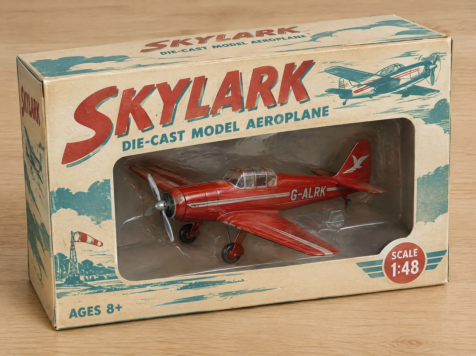
A collectible box where the display lettering, the sub-line, the scale badge and the age mark are all set correctly, and the 1950s look comes from real print behaviour — faded inks, slight registration offset, worn cream stock. The model even lettered a registration onto the tail of the plane, which nobody asked for.
“A photorealistic product shot of a collectible vintage-style toy aeroplane box on a light wooden surface, soft studio light. The box is printed in a 1950s style with a cream ground, faded red and teal inks and subtle print registration offset. The front panel reads "SKYLARK" in large hand-drawn display lettering, with "DIE-CAST MODEL AEROPLANE" beneath it, "SCALE 1:48" in a small badge lower right and "AGES 8+" lower left. A window in the box shows the red die-cast plane inside. All the printed text must be crisp and correctly spelled.”
 Generated
GPT Image 2.5 is the image model OpenAI released on 9 September 2026, and the jump over GPT Image 2 is mostly about editing rather than first-shot generation. These are the differences you can test in one sitting.
Name the part you want changed and the rest of the frame is left alone — swap an outfit without the face shifting, rewrite on-image text without the background moving. This is the change most people notice first, and the reason 2.5 is worth switching to for editing work.
The same character or product holds together over a long chain of edits instead of drifting after a few. Keeping a set on-model no longer depends on structural prompts, reference images and fixed-lighting clauses.
A genuine alpha channel, not a flat colour you have to key out. GPT Image 2 could not do this, so a transparent-background request is the simplest way to tell the two models apart — and the reason 2.5 is the one to use for packshots and logos.
This editor runs gpt-image-2.5-flare, which holds 2.5 quality at about half the latency of GPT Image 2. All 24 examples on this page finished between 9 and 19 seconds at the default quality tier.
Each tier is generated at its own resolution rather than enlarged from a smaller render, across eight aspect ratios from 1:1 to 21:9. The tiers are pixel budgets, not fixed widths — 1K lands around 1.03 megapixels at any ratio and 2K is four times that, so a 16:9 2K image measures 2720x1536.
Headlines, fine print, labelled diagrams, UI copy and multilingual layouts come back legible and correctly spelled — put the exact words in quotation marks and the model renders those words rather than something that looks like them.
One box does both jobs. Attach an image and your prompt becomes an edit instruction; leave it empty and the same prompt generates from scratch. Up to five reference images per request.
"Keep the pose, lighting, camera angle and background exactly as they are; change only the jacket" gets you a changed jacket. Leaving the lock out is what invites the model to rebuild the parts you were happy with.
Eight aspect ratios, three resolution tiers, about 10-20 seconds. Ten credits per image, refunded automatically if a generation fails, and the result downloads at full size with no watermark.
One formula covers almost every prompt on this page, and the first term is the one earlier models did not have.
What must not change + subject + scene, light and lens + exact text in quotes + material and surface detail + layout or aspect ratio + concrete negatives
“Keep the model, her pose, the studio lighting and the seamless grey backdrop exactly as they are. Replace only the tote she is holding with a natural-canvas one, and print the words “FIELD & FLOUR” across it in a bold condensed sans, dark brown, centred and following the fold of the fabric. Match the existing shadow direction and the slight warmth of the key light. Keep the canvas weave visible. No new props, no logo anywhere else, no change to her hands. 4:5.”
The single habit that separates 2.5 from every earlier model. Lead with what must survive — pose, lighting, camera angle, background, identity — then name the one thing to change. Every edit case on this page is built that way, and it is why the shadows and faces held.
Edits compound badly. Move the lamp, look at it, then relight: three prompts and three checkpoints. Asking for the move, the relight and a new colour grade in one go is how you lose the face.
Quote the words you want rendered, spell out the case, and name the type treatment — the words "FIELD & FLOUR" in a bold condensed sans, centred. Describing the text instead of quoting it gets you approximate letters.
Say "on a fully transparent background", "no background" or "cut out" and this page sends the transparent-background parameter and returns a PNG with real alpha. Without one of those phrases you get an opaque image, because transparency is a request setting rather than something the model infers.
Lens length, distance, light source, time of day, film stock, depth of field. "50mm at eye level, soft coastal daylight, shallow depth of field, fine grain" reads as a photograph; "photorealistic, 8k, ultra detailed" reads as a render.
Infographics, slides, UI and posters land far better when the prompt gives the grid first — how many panels, what sits where, what the margins do — and only then fills in the words and images. The dashboard and the espresso diagram above were both written in that order.
With more than one input, say which is which: image 1 is the person, image 2 is the garment, image 3 is the location. Unassigned references get blended, and the blend is never the one you wanted.
Asking for "a 16-frame run cycle" returns sixteen near-identical drawings — we tried it. Describing the pose of each frame is what produces motion, and the model will hold the character identical across all of them while the pose changes.
GPT Image 2.5 launched with three features that live only inside ChatGPT: Sketch (drawing a rough layout for the model to read), the 15 creation templates, and commenting directly on an image to request a change. None of them are exposed through OpenAI's API, so no site running GPT Image 2.5 through an API can offer them — this one included. If a page tells you otherwise, it is describing the ChatGPT product and selling you API access.
Everything else on this page is API behaviour, and every example above was produced here. The nearest thing to Sketch that does work is the sketch-to-photograph case: hand the model a photo of a drawing as a reference image and it will read the layout out of it.
All three run in the same editor, so switching costs nothing but ten credits. The row that decides it for most people is whether the job is “make me a picture” or “change this one thing about my picture”.
| Feature | GPT Image 2.5 | GPT Image 2 | NanoBanana Pro |
|---|---|---|---|
| Made by | OpenAI | OpenAI | |
| Released | 9 September 2026 | 2026 | 2026 |
| Best for | Changing one part and keeping the rest | Instruction-following & text-rich layouts | Multi-reference work & in-image typography |
| Scoped edit (change one region) | Yes — the headline change | Partial — tends to rebuild the frame | Partial |
| Native transparent PNG | Yes, real alpha | No | No |
| Consistency across many edits | Holds without prompt scaffolding | Drifts after a few rounds | Strong for identity |
| Resolution | 1K / 2K / 4K native | 1K / 2K / 4K | 1K / 2K / 4K |
| Aspect ratios | Eight, 1:1 to 21:9 | Seven | Seven |
| Typical time per image | 10-20s (Flare) | 20-60s | 20-60s |
| Credits per image | 10 | 10 | 10 |
| Commercial use | Yes | Yes | Yes |
Timings are our own measurements at the default quality tier. Last updated: 10 September 2026.
GPT Image 2.5 is the image model OpenAI released on 9 September 2026. Compared with GPT Image 2 the jump is mostly about editing rather than first-shot generation: you can name one part of a picture and have only that part change, the same character or product survives many rounds of edits instead of drifting, and transparent PNG is finally native. It is a unified model — the same endpoint generates from text and edits an existing photo from a plain-English instruction.
They are two tiers of the same model on the API. Flare is the default and matches 2.5 quality at roughly half the latency of GPT Image 2 — the right pick for social, e-commerce and anything high-volume. Sunburst spends longer per image for extra precision, which shows up in skin, fabric, dense typography and complicated product surfaces. This editor runs Flare, because someone is watching a spinner here and a minute of extra wall-clock is a worse trade than a marginal fidelity gain.
Three differences you can test in one sitting. First, scoped editing: ask 2.5 to change only the chairs and the camera angle, floor shadows and every other object stay put, where an older model rebuilds the frame. Second, consistency across rounds: the same subject holds together over a long chain of edits without you stuffing the prompt with structural constraints. Third, native transparent PNG — GPT Image 2 could only fake a cutout with a flat backdrop you had to key out yourself, so a transparent-background request is the simplest way to tell the two models apart. Output is also sharper and generation is faster.
Yes, with real alpha rather than a white rectangle. Say it in the prompt — "isolate it on a fully transparent background", "no background", "cut out" — and this page sends the transparent-background parameter and returns a PNG, storing it as a PNG so the alpha edge is never transcoded to lossy WebP. The cutout case further down this page is a genuine alpha PNG shown on a checkerboard, which is how every image editor displays transparency.
Eight aspect ratios — 1:1, 2:3, 3:2, 3:4, 4:3, 9:16, 16:9 and 21:9 — at 1K, 2K or 4K. We measured all eight on 2026-09-10 and none was snapped to a neighbouring ratio, though the match is close rather than exact: every dimension comes back as a multiple of 16, so ratios that land on that grid are exact (1:1 gives 1024x1024, 3:2 gives 1248x832) and the rest are within half a percent (4:3 gives 1168x880, 16:9 gives 2720x1536); 21:9 is the loosest at 1.4%. The tiers are pixel budgets rather than fixed widths: 1K is about 1.03 megapixels whatever ratio you pick, and 2K is four times that, so a 16:9 2K image is 2720x1536 rather than a literal 2048 wide.
About 10-20 seconds. That is measured, not estimated: the 24 example images on this page were generated on 2026-09-10 and every one finished between 9 and 19 seconds at the default quality tier. Very dense prompts and 4K jobs can take longer.
No, and it is worth knowing before you plan around them. Sketch input (drawing a rough layout for the model to read), the 15 creation templates and commenting directly on an image are ChatGPT features at launch — they are not exposed through the API, so no site running GPT Image 2.5 through an API can offer them, this one included. Everything else on this page is API behaviour you can run here right now.
Ten credits per image. New accounts get free welcome credits, and credit packs start at $9.99 for 350 credits — about 35 images. There is no subscription, and credits are refunded automatically if a generation fails.
Yes. Per OpenAI's terms you own the images you generate through the API and may use them commercially, at full resolution and with no watermark. Check the current OpenAI usage policy for any specific use case.
On our own CDN, permanently. Results are copied to cdn.sparkpix.ai before the URL is saved, so they do not disappear when an upstream provider clears its cache. Photos you upload as references are deleted within three days; your results are yours to keep.
OpenAI's previous image model — still strong on instruction-following and text-rich layouts, and the one to compare against when you want to see what 2.5 changed.
Google Gemini 3 Pro Image — several reference images at once and the strongest in-image typography of the Google line.
ByteDance's flagship — targeted single-instruction editing at 1K or 2K, with photorealistic lighting and skin.
The de-AI job on its own page: strip the waxy skin, orange cast and plastic bokeh out of a generated image.
Just need a cutout? A dedicated one-click background remover, no prompt to write.
Push a 2K result to 4K and beyond when a print job needs more pixels than a generation gives you.
Got an image and need to know whether a person or a model made it? Reads C2PA credentials and scores the pixels in 2-3 seconds.
The one-click version of the same job: undo a beauty or colour filter without writing the instruction yourself.
The viral matcha-green filter, reversed in one click — no prompt to write.